CSS and CARP Design
Overview
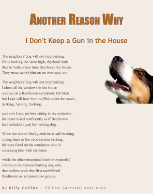
In this project the goal was to take a boring eyesore of a poem layout and apply the four principles of CARP to make it look appealing to the eye. We followed a step by step document in order to apply several different properties to the CSS file in Dreamweaver.
Contrast
For contrast I kept the headings and body text significantly darker than the background. I also used two different fonts, one for the headings and author line, and another for the main body text. I also used both center and right alignment.
Alignment
For alignment I made sure all of the body text was aligned right since that is how best to place large amounts of text to make it easier to read. The heading I centered to make it stand out most.
Repetition
For repetition I made all of the colors on the file come from the colors of the dog image by using an eyedropper. I used about four shades of tan for a uniting feel.
Placement
For placement I moved the dog off to the side of the text rather than over it because the picture of the dog is not as important as the actual poem.
What I Learned
Overall in Dreamweaver I learned how to apply very specific actions to achieve a certain predefined outcome, where in my last web project it was a lot of messing around and guessing.


Comments
Post a Comment