Logo Design
Brainstorming
I started out with a page of sketching to just get my ideas on paper. Most of my ideas remained centered around my initials. My main ideas were to make the dot in my 'j' an explanation mark or flowery burst. I then started playing with cursive since the cursive 'j' and 'l' are sort of a reflection of each other, at least in my handwriting. I played with incorporating triangles or circles for my central shape, but I couldn't seem to make a triangle work without the logo looking reminiscent of a construction company, or Adidas. I ended up favoring a design that incorporated the burst, cursive, and a circle. I chose to focus on that one and get started in Illustrator.
Creating
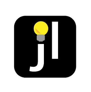
I spent probably a day a half just doing my main circle idea, as you can see below it takes up whole fourth of my workspace. I had to rely on google fonts to find a cursive font that twisted in a way similar to my handwriting, and even then I ended up having to use the curved line tool for the side strokes. I was really happy with this logo, but I just couldn't stop thinking about how much it looked like a lemonade logo. Maybe that's just me? So I then went back to some other ideas, even in Illustrator none of my triangle ideas came out right. I played adding back in the 'l' and capital letters. I got a boxy overlapped sort of logo that I actually really like. However, I found that the sharp lines were a little too aggressive for my personality. So I went back to my explanation mark idea, playing with a few different fonts. I was enjoying the look so I decided to add yellow as an accent, and thats when I got my final idea. The yellow made me think of lightbulbs, a good symbol of creativity and ideas. I decided to try and use that for the dot on my 'j' and designed a simplistic bulb. I also squished the long rectangle into a more square shape. I loved it. So I squished down the edges and mocked up my idea. Something that made me love the logo even more was that if I didn't want to use the full logo I could represent it just as the lightbulb.
Conclusion
All in all, I'm more than satisfied with the outcome of my logo. It isn't anything that I would have originally thought of. But I'm love the simplicity that I was able to achieve. I think that overall my logo represents me well.


Comments
Post a Comment