C.A.R.P. Poster Design
Contrast
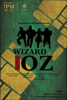
To incorporate contrast I used a different font for "Olathe Northwest Theater Presents", the website links, and the credits than I used for the title, time, and price. I also used color contrast by making different words in the title different colors to draw your eyes through it. I also placed a red block by the title, using a strong color and only in one place really draws attention to that space. I also made sure to use yellow for the important information about the play so it would contrast and pop against the green background. I used less contrast for the information about website links, "Olathe Northwest Theater Presents", and the credits because they are less important to the general audience.
Alignment
For alignment the "visit" information is aligned with the end of the credits. The time information isn't quite aligned with the other side of the credits, but it is equally as far from the edge as the "visit" information. The red bar by the title is aligned with the height of the font for "OZ" and the bottom edge of the "W", because the line goes out towards the top and would make full alignment look uneven.
Repetition
For repetition I made sure to make the font either Baskerville or Myriad Pro. I also made sure that the yellow I used matched the yellow in the background image. I made the four different credits equally as wide and equally as far apart from one another for consistency but also to help distinguish them.
Proximity
All of my information is grouped very clearly. The date information is stacked and the ticket info is stacked next to it, since they are both very important. All of the credits are grouped together, as well as the visit information.


Comments
Post a Comment